ShopDreamUp AI ArtDreamUp
Deviation Actions


Description
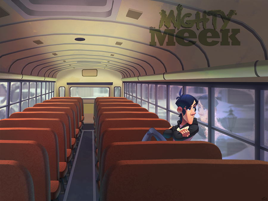
I´m finishing the characters designs so, the next step is starting with the pages. I wanted to be sure about the style, if the characters fit in the environments.
So, What do you think? Does it fit into the environment?
So, What do you think? Does it fit into the environment?
Image size
900x674px 386.79 KB
© 2012 - 2024 EduHerrera
Comments10
Join the community to add your comment. Already a deviant? Log In
Woah, great work!